Wednesday, 1 May 2013

Lesson #2

We had our second visual comms lesson.

Mr Seow taught us about using negative space for our logo design for our CA. I feel that using negative space is really cool as another picture can be formed if we're creative enough! For example:


Image cr: http://www.graphic-design.com/design-bookshelf/negative_space/negative_space_h.png

We also learnt about using our pencils as "measuring sticks" to measure the proportion of what we will be drawing! There is also a "draw with pencil and thumb" method and using our pencils to find angles. I think its a really useful way of drawing in proportion to whatever we will be drawing as it is accurate but I can't really get how I go about using it and I will have to improve.

We practised this exercise first on drawing a dog.


This is the bigger picture of the dog I drew.

I find that using the pencil as a measuring stick is a little difficult to learn how to use and I got a little distressed but it was great nonetheless. (Although the turnout wasn't that good -note the dog above)

We then had to pair up and had to do a sketch of our classmate using the pencil as measuring stick and we had to sketch them proportionately! I paired with Jia-chi and this is my sketch of her:
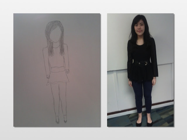
Didn't really do a good job I'm sorry
We then learnt about textures which are "surface" designs which support the illusion of real substances or present invented composites. Then we had to do up 3 textures, one representing ourselves, another from our surroundings and the third futuristic or modern texture.

Texture that represents me
 This is the texture that represents me. I drew laughing faces with small eyes because I like to laugh and I'm asian (STEREOTYPE).

Texture in my surroundings
 This is the texture of my surroundings. Its supposed to be the apple logo but it doesnt look like it. Everyone's using Macbooks thus I drew this.

Futuristic/ modern texture
This is a futuristic texture. I drew samsung as I believe samsung everyone will use samsung in the future.

The next activity was to draw in proportion what we saw at the designated places we had to go. I stayed at the bridge and drew what I saw, trying my best to use the pencil as a measuring stick.

This is the bridge.

And this is my drawing of the bridge. I tried my best.

Friday, 19 April 2013

Lesson #1

For the very first lesson, the first activity we did was to learn to draw cartoon characters using basic shapes like circles, rectangles and squares etc. We drew an elephant and the kungfu panda. So basically, we were taught to start off with faint sketches of basic shapes to roughly do up the shape of the character, like whether its body parts are round or squarish or whatever shape. After that, we have to go over the rough sketches with bolder outlines and more defined lines and shapes - adding the details so we can have the cartoon characters we always see!

And I dont know if its just me but I felt like a professional after looking at the faint basic sketch and the defined outlines, reason being I used to watch those adverts on disney channel where they teach you how to draw the characters and they start off with really basic shapes and all of a sudden in 4 steps, it transforms into a cartoon character. I was always amazed by that and never thought I could do it, but after the first lesson I actually managed to do it! (Although my drawings are not that good, but hopefully there will be improvement)

I also learnt to look at all these complex drawings like in a simpler way first and then later moving on to add in the details! Its a much simpler way to produce a nicer looking picture without so much stress I realised.

Picture of the actual elephant and my drawing of the elephant.
Picture of the panda and my drawing of the panda.
We were then told to draw a "naked" figure also using basic shapes and slowly adding in the details but (confession) I didnt draw the basic shapes first but instead went straight into the drawing. Later on I did another drawing, because I thought the first was really ugly and weird. I thought it kinda looked better and more accurate with the figure shown on screen after my second attempt!


This is the better version of my drawing of the "naked" figure
Moral of the story is to apply what you learnt in lesson I guess.

An imitation Kenneth's signature

And an upside down imitation of Kenneth's signature
The next activity was to get a friend's signature and copy it upside down. It was tough, like really tough because I couldn't get it to look alike even though Kenneth's signature was so easy!! The whole time while on the signature exercise, Mr Seow was telling us to follow the lines closely, take note of the angles and follow as close as possible and stuff like that so I was trying but my lines just seem so........ weird. I tried my best though.

This is supposedly my "signature".
And the last activity of lesson 1 was to copy a drawing.

SO HERE IT IS!!!! Like the best rose I have ever drawn.
Yes we had to copy the drawing of this rose upside down from the screen (it didnt look like that, it just looks mutated in my drawing) and I have to say that it takes alot of patience and determination. I know I know, sound like typical ten years series answer but its true!! This is because usually if a drawing is too hard for me to do, I'll either give up or just trace it over but because this was on the screen and it was class work, I guess i couldnt and had to finish it myself. 

Initially I didnt do it by drawing the basic shapes and stuff but after that we were advised (reminded maybe..?) to use the shapes and slowly do the outlines and details and it was easier and thus I achieved this! /points to rose above/

Moral of the story is to always apply what you learn in class.